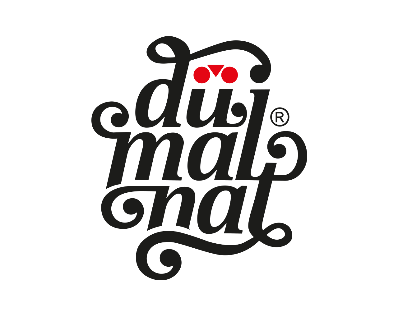
The Dümalnat logo embodies the essence of the brand, born from a love for cycling and deeply rooted in the Lombard region, as suggested by the use of Milanese dialect in the name. The word is arranged in three lines to create a solid and recognizable visual composition, with a "round" shape designed to ensure versatility in various application contexts. The curls of the letters evoke an urban and rebellious spirit, inspired by streetwear and the vintage style of the '70s and '80s.
The umlaut above the "u" transforms into a pictogram: a stylized bicycle that symbolizes movement and freedom, central values for Dümalnat. In the simplified horizontal version, designed for more institutional contexts, the bicycle pictogram remains the distinctive element. To explore the Dümalnat universe, visit the In-House Brands section.
The umlaut above the "u" transforms into a pictogram: a stylized bicycle that symbolizes movement and freedom, central values for Dümalnat. In the simplified horizontal version, designed for more institutional contexts, the bicycle pictogram remains the distinctive element. To explore the Dümalnat universe, visit the In-House Brands section.