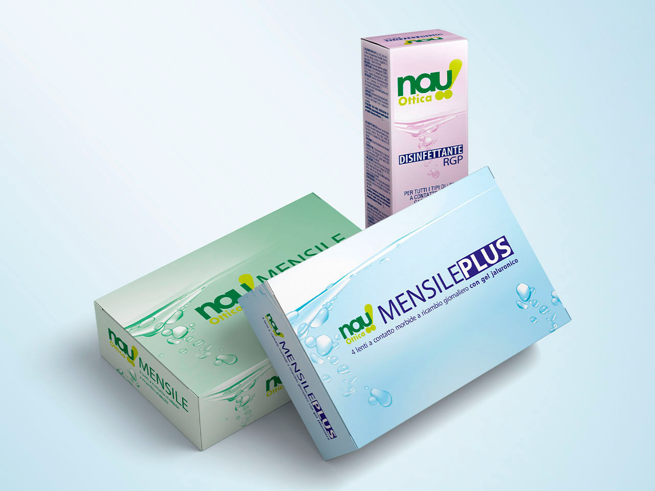
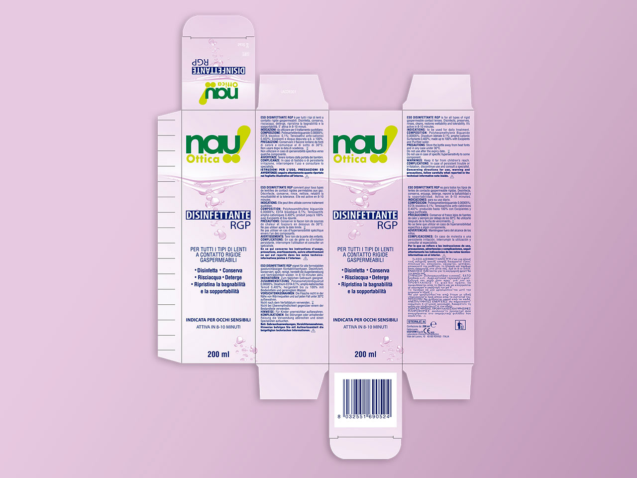
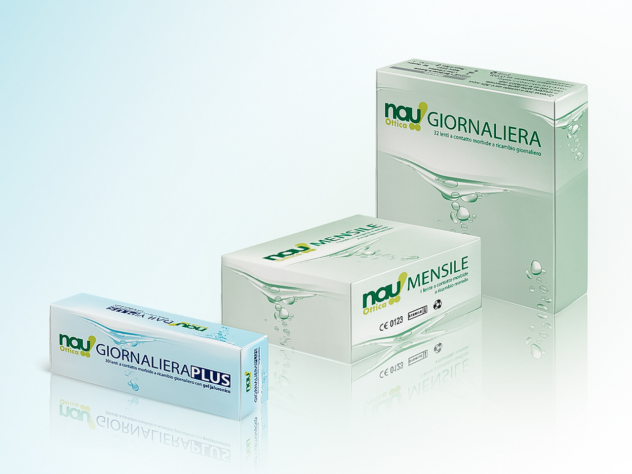
We developed the packaging for a range of contact lenses and care products, organized into two main lines: BASIC (green) and PLUS (light blue), while the purple color distinguishes the disinfectant line.
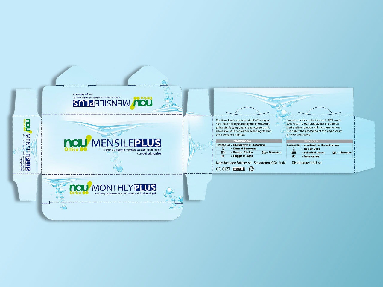
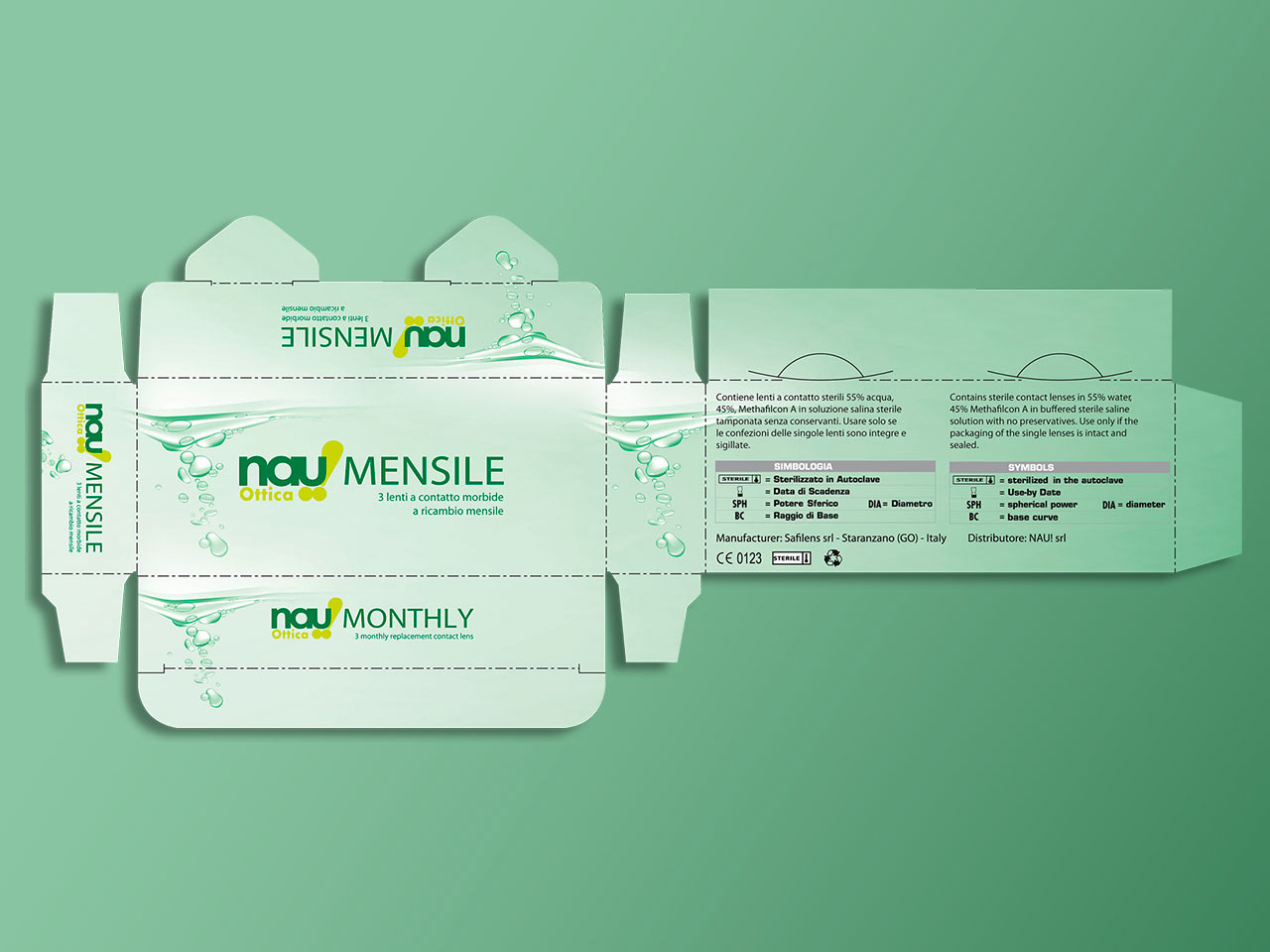
The design, inspired by water as a symbol of freshness, uses fluid waves and droplets, enhancing the packaging without compromising readability. The pastel color codes create a coordinated and easily recognizable image, conveying modernity and order.
The design, inspired by water as a symbol of freshness, uses fluid waves and droplets, enhancing the packaging without compromising readability. The pastel color codes create a coordinated and easily recognizable image, conveying modernity and order.