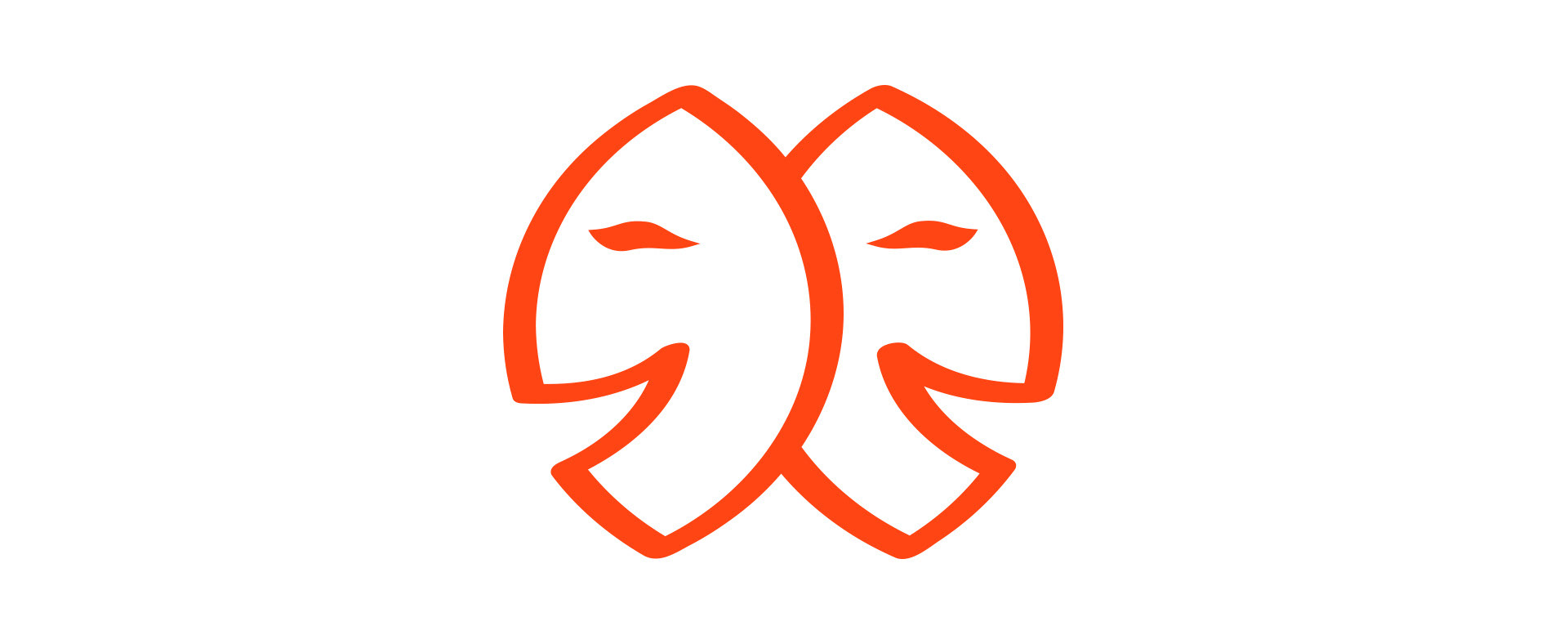
Samarcanda, a leader in tourist entertainment since 1987, entrusted us with the restyling of its logo to reflect its market positioning. The original logo, consisting of a simple commercial font and two stylized smiley faces inspired by theatrical masks, was refreshed while maintaining a strong connection to its historical identity.
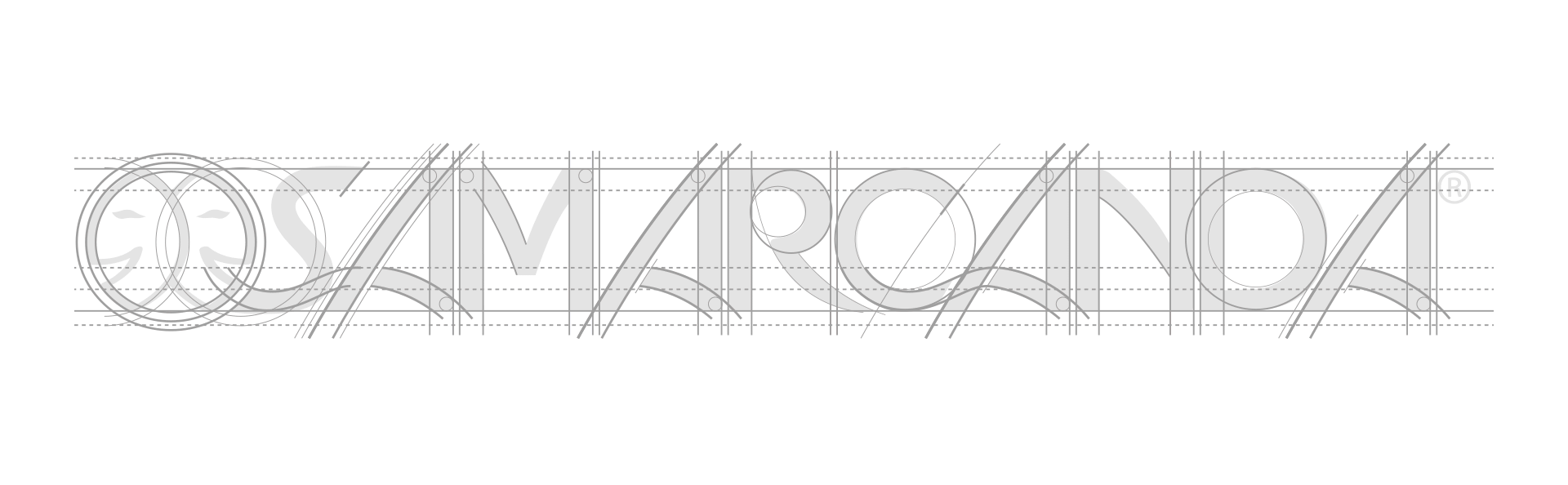
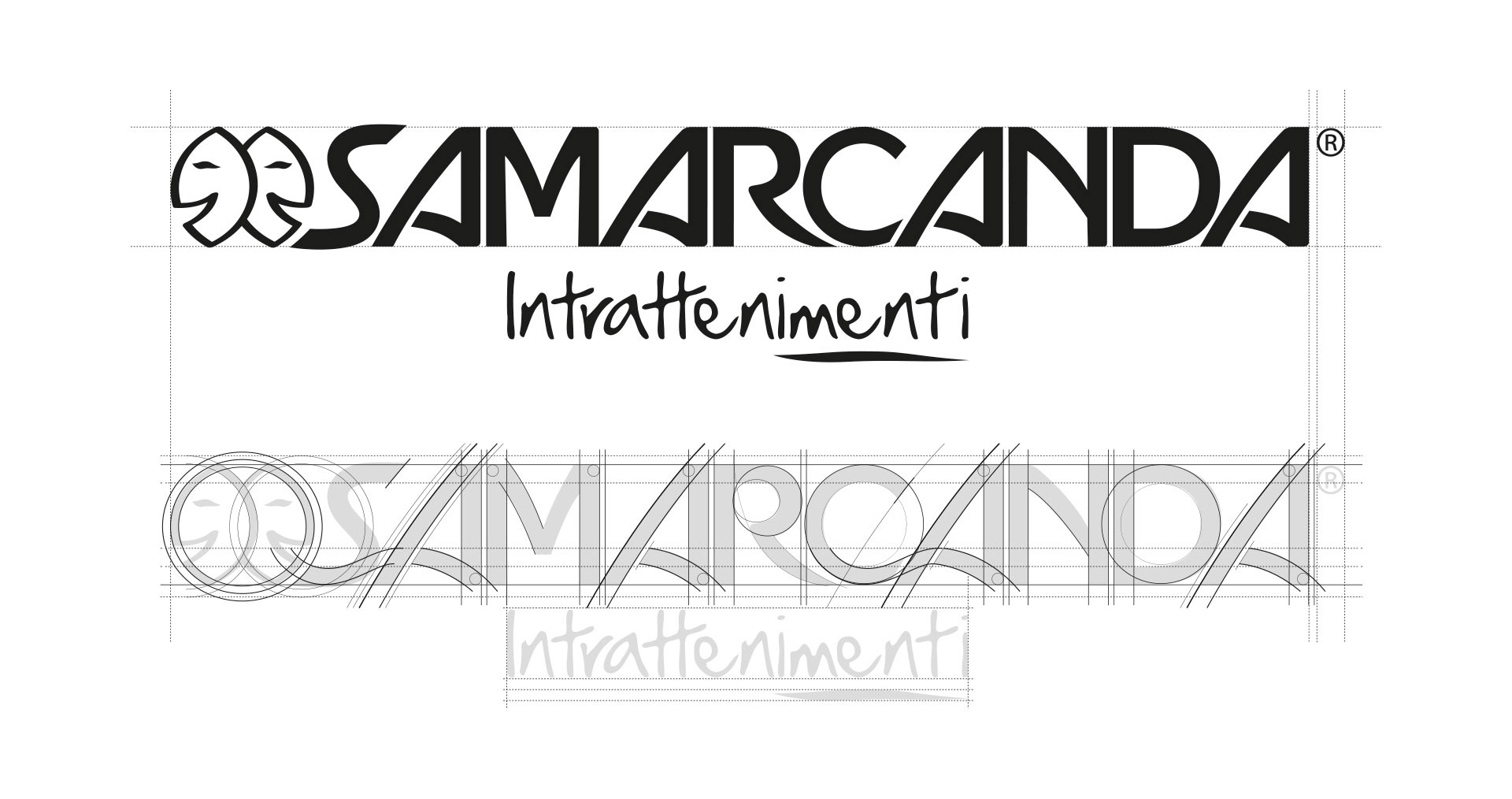
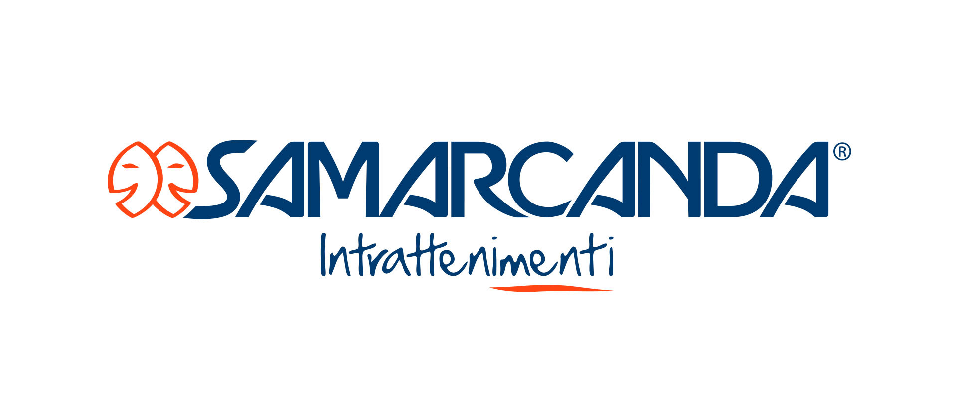
The new design introduces a unique and harmonious lettering, connected by a wavy line that evokes the movement of the sea and the dynamism of entertainment. The smiley faces were lightened, with thinner profiles and more defined colors, for a better overall integration.
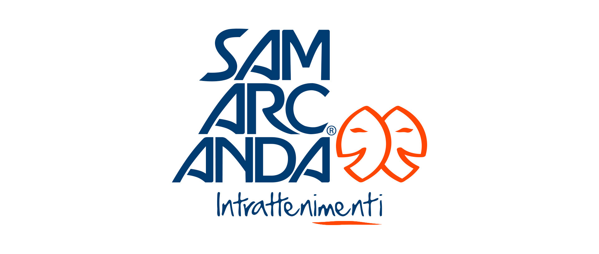
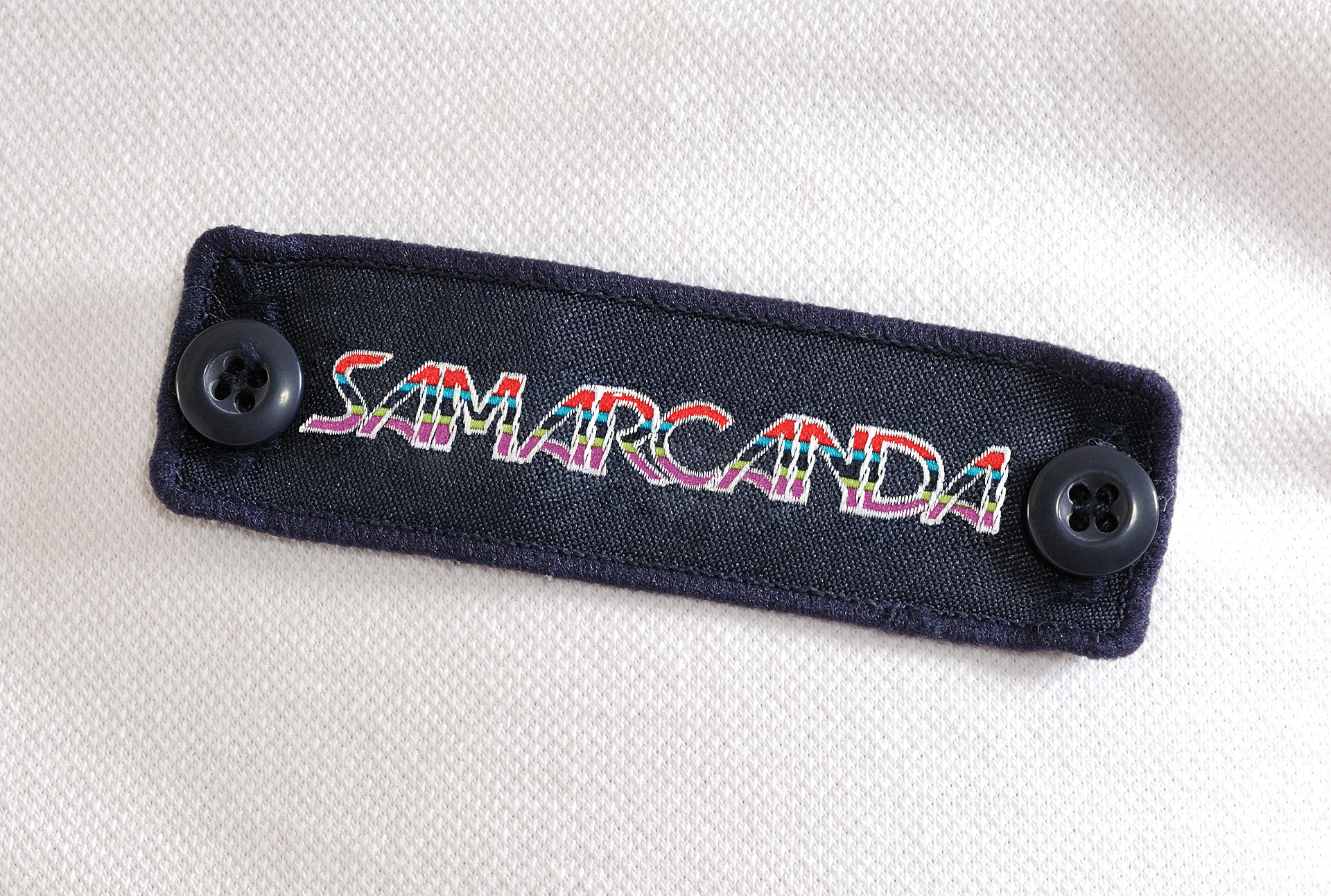
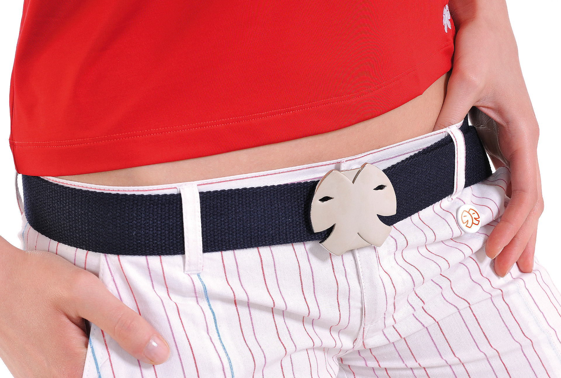
We also developed a compact version of the logo for use in smaller spaces, accompanied by a usage guide and color combinations, ensuring consistency and versatility in every application.
The new design introduces a unique and harmonious lettering, connected by a wavy line that evokes the movement of the sea and the dynamism of entertainment. The smiley faces were lightened, with thinner profiles and more defined colors, for a better overall integration.
We also developed a compact version of the logo for use in smaller spaces, accompanied by a usage guide and color combinations, ensuring consistency and versatility in every application.